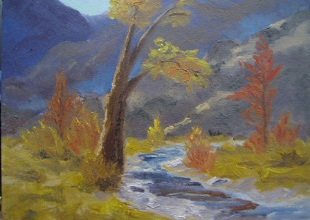
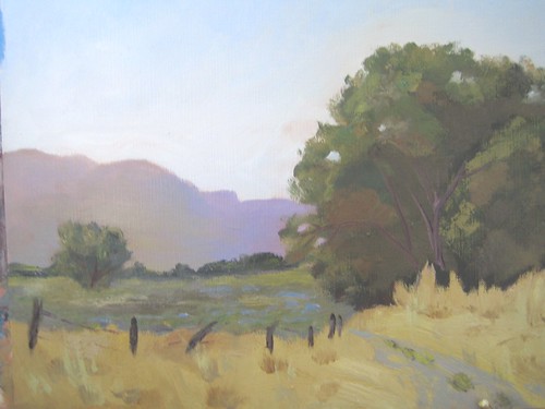
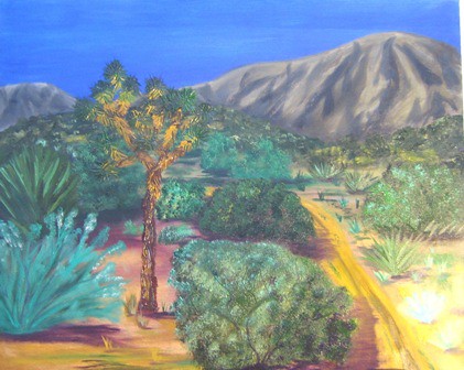
9 x 12 water mixable oils on canvas panel. Plein air class this morning was in Valyermo. The fall colors are almost gone. It was cool, then nice when the sun came out, then cool again when the sun moved and we were in shade! When we stopped here, there was a doe getting a drink, she bounded back up into the mountains. A hawk flew over a couple of times. So cool to be out and see the wildlife!
Saturday, December 10, 2011
Saturday, November 26, 2011
Poplar among Cottonwood
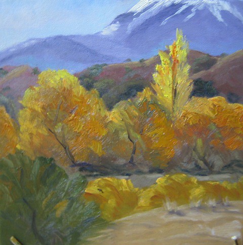
12 x 12 Canvas wrapped board, using Cobra water mixable oils. Painted en plein air off road near Valyermo.It was a beautiful day for painting, the sun was shining, and the weather was mildly warm for late fall. It had been a couple of months since I'd painted, felt SO GOOD!
Friday, September 16, 2011
Small Wash Picnic
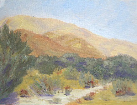
Yesterday Mike had the idea to pack up a picnic lunch and head up over the hills above our house. It had been too long since I'd had time to paint, so I immediately jumped up and had my plein air gear ready to go in about 2 minutes! I don't normally paint small, but decided on a 6 x 8 panel. This is done with WMO (Cobra) oils. It was 1 p.m., so not the prime lighting time for painting, but I take what I can get. LOL!
Tuesday, August 02, 2011
Soledad Canyon Wash
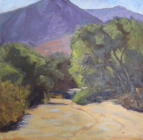
12 x 12 oil on canvas -- using Cobra water mixable oils. This was my first plein air workshop on July 23. I had one big obstacle, the water mixable oils got thick and gummy in the heat. I posed the problem on WetCanvas and was given several solutions to try. The next week (previous post) I tried one and had success! This painting, because of the gumminess I experienced, I had to touch up a bit at home. I also still needed to add the tree trunks and some spots of color on the sand.
The location was right in the middle of the wash, located in Acton. The sand in the wash was so thick I think the legs on my easel must've sunk a good 12 inches - LOL! It was a great experience and I thoroughly enjoyed instruction from Richard Gallego (gallegoart.com). Rich's impressionistic style is very appealing to me and I hope I can get away from my realistic style.
Monday, August 01, 2011
Hot Hay in July
Plein air in Leona Valley, oils on 9x12 canvas. I did not realize how much hotter it would be to set up on hot, dry, hay rather than the dirt road. The heat reflected up off of the yellow grass hay and made the 3 1/2 hours out there pretty miserable. I did thoroughly enjoy the outing, though, and the scene was SO summertime! There were some blue flowers still blooming in the meadow and the contrasts of yellow and green were very appealing.
I continue to use the Cobra water mixable oils and continue to love them. I mixed linseed oil and water (50/50) and that worked perfectly as a medium to keep my paint smooth and creamy on the palette. Clean up is still soap and water.
My plein air paintings are done with a primary palette -- UltraMarine, Azo Yellow (which is being switched to Cad Yellow), Naphthol Red Medium and Titanium White. I'm finding that mixing in the field is very doable and sure makes for a lighter load in the french easel!
Wednesday, July 20, 2011
July
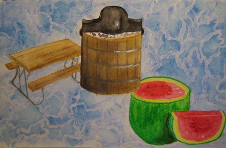
The July challenge in the Watermedia Forum at WetCanvas was to paint something that described what "July" means to you. When I look back over my lifetime, there are four elements that were always present in the month of July. . .water, picnic tables, ice cream freezers, and watermelon.
When I was a kid, we'd travel from AZ to OK every summer (usually in July) to see family. I remember being at my grandparents farm and taking turns with my cousins sitting on the burlap bags that covered the hand-crank ice cream freezer as Grandpa would churn that ice cream. Grandma had a picnic table that my Uncle Ledger made from steel piping and heavy planks of wood -- it was built to last and it did! We'd always eat on that picnic table in the back yard. Cold watermelon was a usual treat, but I don't remember Grandpa growing melons. . .he had acres of corn mostly, but also one plot of land where he'd grow strawberries and then there was the "house" garden where all the vegies were planted.
Our parents would drive us out to Beaver's Bend where we could swim at the "swimming hole," and we occasionally went into creeks (although my mom didn't let us do this often because of all the water moccasins). We moved from AZ to CA when I was 12, the summertime trips to OK became every other year and then on the years when we didn't go to OK, we'd go to Lake Shasta and waterski every day for 2 weeks! Yes, we'd have watermelon, and we sat at picnic tables, but we didn't churn ice cream. As I grew older, water continued to be a part of summertime, we'd tube the Mokelumne River in Lodi, CA, paddleboard Lodi Lake, go skiinig at Hogan Lake or Comanche Lake and swim at the Lodi H.S. West Campus public pool. Now that I'm grown, my kids associate all these things as summertime "fun in the sun" and I can already see that they will become memories for my grandkids!
My challenge was done on a 5x8 sheet of Raffine ArtSketch paper and I used watercolor pencils (Faber Castell and Derwent Inktense) to paint it and Dr. PhMartin's Bleed Proof White ink for accents.
Thursday, July 14, 2011
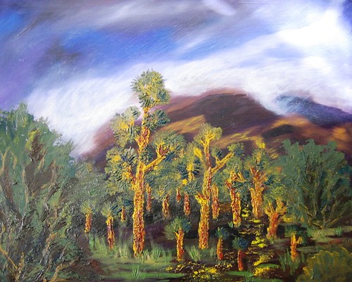
Reworked - Three Joshuas at Sunset
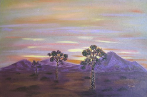
I toned down the mountains with a layer of glaze and deepend the orange just behind the mountains. Not sure if this is the final or not. . .still studying it on the easel ;-)
Tuesday, July 12, 2011
Three Joshuas at Sunset
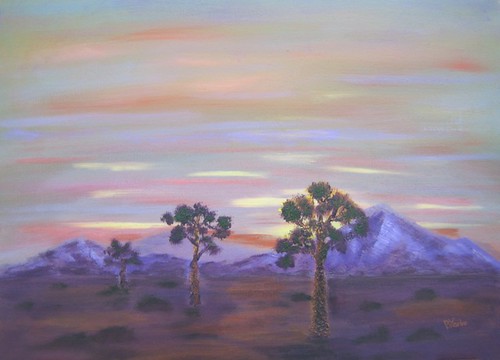
18 x 12 water mixable oils on stretched canvas.
The purple isn't quite as vivid as it is on the monitor -- I tried to get it to be true to the actual painting, but couldn't quite "get it!"
Thursday, June 02, 2011
High Desert One
 A couple of days ago I took my watercolor gear up onto the hills above our house and did a plein air landscape. I used that watercolor as a reference to paint this WMO. I've never painted plein air and decided to give it a try. I plan on doing more studies like this because I had a blast painting en plein air AND I'm hoping it will be a method to help me learn impressionistic style with my WMOs. This painting is a 9x12 on canvas paper. I use mostly Cobra paints, and have a few Holbeins in my box. The only Holbein used on this was raw umber. I'm having problems getting the yellow ochre to not look so orange on my photos! There is NO orange in this painting.
Tuesday, May 17, 2011
Lone Joshua
Oil on 20 x 16 cotton canvas. The lower right corner is not as light as it looks in this post. . .that is purely the result of my poor photography skills :-) The photo reference was one I took while hiking on our hills. I'm finding myself drawn to desertscapes since I've been hiking on our hills rather than walking in the neighborhood. There's so many truly wonderful views providing me with lots of reference photos. I'm thinking lately about hauling supplies up and trying plein air! Desertscapes are new for me; I've always favored lakes, rivers, and large trees. After 18 years of living away from my "preferred" scenery, I'm finally embracing the desert I live in and truly appreciate the many shades of brown, red, lavender and yes, even green!
Monday, May 02, 2011
Joshua Soldiers
I was going to call this Joshua Stand, but changed it to "solders" because of current events.
This is a 20 x 16 oil on
masonite board. I'm attempting palette knife painting; the background sky and mountain were done with brushes, but the entire mid and foreground are done with palette knives. The ref photo is from a personal photo taken up on the hills where I hike with my husband. It was a breezy morning, as indicated by the cloud cover coming over the mountains; those clouds are actually marine layer fog and clouds. The hills still have their dots of yellow from our spring wildflowers.
Monday, April 25, 2011
Sunset on the Delta
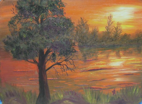
Water miscible oils on 9x12 canvas paper. This one almost went into the trash, but I posted it on WetCanvas and had some very good critiques and was able to salvage it. I love sunrises and sunsets and am finding them easier to get down with oils than with watercolors.
Thursday, March 10, 2011
Still Life Lesson 7
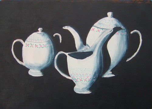
Franciscan Crinoline Tea Set done on 9 x 12 canvas paper with Cobra and Holbein water miscible oils. The background and shadows are Indigo with turquoise blue mixed in, the teapot, sugar and creamer were done with titanium white with a dot of cerulean blue and then zinc white for some sparkle highlights. The china pattern is painted with quin rose, turquoise blue and pthalo green all lightened with titanium white.
I've always wanted to paint one of my teasets and this was quite a lot of fun! Of course, there's always areas that I'd do differently if I were to do it again, but I'm mostly happy with this.
Friday, February 18, 2011
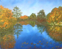
Lake in Broken Color
The second part of lesson 4 is broken color technique. Painted on 9x12 sheet of Canvas Paper, using water miscible oils, reference photo from Nel Jansen. An undercoat was applied in vermillion and allowed to dry. I decided on the vermillion because it is the compliment of blue (which there's a lot of in this landscape) and also because it would fit in with the fall foliage.I chose to do the sky and lake smooth and then use the broken color technique for the vegetation. I have a looooong way to go in learning this technique, but found the assignment fun.
Thursday, February 10, 2011
Red Tulips
Lesson four in Oils class: lost edge. I was ready for a simpler subject (after two landscapes) and thought these tulips would be perfect since Valentine's Day is coming. I tried something new-to-me for the background by mixing Burnt Sienna and Cobra's Light Gold and applying with a "X" motion. I applied the left side heavier than the right side. In real life it almost looks like suede, I LOVE it! What a fun color this light gold is going to be as an additive! Painted on a 9 x 12 sheet of Canvas Paper.

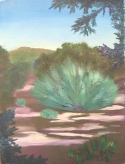
Friday, February 04, 2011
Sagebrush 2
With corrections. I'm happier with this now.
Now to wait and seewhat my teacher thinks of it. There's ALWAYS room for improvement.
Now to wait and seewhat my teacher thinks of it. There's ALWAYS room for improvement.
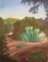
Wednesday, February 02, 2011
Sage Brush
Still working from the same ref photo, but with a crop. I didn't get the sage bush as blue as it should be, it was more "true" the first time I painted from this ref photo. I DO like it with no clouds. I'm having some problems with my "cools" and "warms" with the oil paints. I think I'm concentrating more on darks first and then am not remembering to check the color temperature.
Friday, January 28, 2011
Juniper Forest-Lesson 3
For oils lesson three we continue to learn about composition. Photo ref was taken while hiking in the hills above our house a few days ago. There is a lovely high desert meadow and mini juniper forest that I really like to walk through. There's lots of dappled shade and a variety of desert vegetation. Royal Talens water miscible oil is now under the brand Cobra instead of Van Gogh H2Oil. Same paint, different look to the tube :-) I also have a few tubes of Holbein Duo -- I like all of them equally well.
Monday, January 24, 2011
Pears
We are still working in composition in Nel's class, this week it was to paint with a "path of dark" or a "path of light." Originally the shelf was dark but it melded into the striped wall and made the pears look like they were floating, so I lightened up the shelf. I MAY have lightened it too much as I think I've lost the "fork" shaped path of dark. I do think it's more appealing this way, though.
This was done with two colors plus white and I used Van Gogh H2Oils in Indian Yellow and Blue Violet. I found out that Indian Yellow is VERY transparent, which made the pears to be most difficult. I used a variety of blending brushes, especially on the shadows and shading. Note to self: Check transparency before deciding on colors!

This was done with two colors plus white and I used Van Gogh H2Oils in Indian Yellow and Blue Violet. I found out that Indian Yellow is VERY transparent, which made the pears to be most difficult. I used a variety of blending brushes, especially on the shadows and shading. Note to self: Check transparency before deciding on colors!
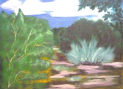
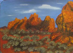
Wednesday, January 19, 2011
With Corrections
Okay. . .I couldn't stand the "marching ants" and so pulled up some of the bushes and gave some others some growth vitamins ;-)
For some reason (probably better/morning lighting) this one is brighter and more true to life.
For some reason (probably better/morning lighting) this one is brighter and more true to life.
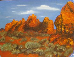
Tuesday, January 18, 2011
Intermediate Oils - Lesson 1
The finished painting after much angst. I haven't painted with oils in over a year and ran into memory blocks while working on this. The vegetation was done at the end of the day and I had lighting problems, didn't see the "marching ants" effect of their placement until just now. I'd like to redo this painting after I finish the course. I love the reference photo and have always been partial to desertscapes that have the red rock against a vivid blue sky.
Subscribe to:
Posts (Atom)