I think I'm getting a handle on this technique. . . my paintings are looking at least a little similar to the photo refs. I'm still using DS paints. I truly love working on Yupo, it's so unpredictable and spontaneous.
Tuesday, June 24, 2008


Monday, June 23, 2008
Forest Bridge on Yupo
Another expressionistic piece on Yupo using DS paints. This one is actually pretty close to the ref photo, which I found on WetCanvas. It has multiple layers and multiple water sprays -- I honestly lost count, but there are at least 6 layers in some places. I'm continuing to have a blast with this technique on Yupo.

Thursday, June 19, 2008
Lagoon on Yupo
This is the first Yupo I've done lately that actually is similar to the photo ref! Also, this is more impressionistic than yesterday's (which most defnitely was expressionistic with a touch of abstract) LOL! I'm still having a blast working on Yupo and still using DS paints.

Wednesday, June 18, 2008
TREES AT CANYON EDGE

I can't believe how much fun I'm having with Yupo and watercolor!! This one started out to be Joshua Trees in the desert - LOL! Yupo really dictates what it wants to be -- so, trees at the edge of a canyon drop is what we have here! I really loved how the paint for the tree bark reacted. I keep forgetting to tell the sequence of painting these. . . choose the subject or photo ref first (I don't know why, because it doesn't turn out to be that anyway), choose your palette and squirt some paint in the pans (keep it moist -I'm covereing my palette with Press and Seal plastic wrap), spray the Yupo with a bit of water (enough so there are visible drops all over, but not running), using a large flat brush apply the pigments to the Yupo (do NOT add water to the pigments in the palette pans), squish and stroke the paint all over the Yupo putting your colors in the basic area that the photo ref shows you. Let dry. After it dries, see what it wants to be and then proceed by lifting paint and/or adding paint. Squirt with water - just a little fine mist. Let dry in between each layer and add a few little details if you want and call it done!
I can't believe how much fun I'm having with Yupo and watercolor!! This one started out to be Joshua Trees in the desert - LOL! Yupo really dictates what it wants to be -- so, trees at the edge of a canyon drop is what we have here! I really loved how the paint for the tree bark reacted. I keep forgetting to tell the sequence of painting these. . . choose the subject or photo ref first (I don't know why, because it doesn't turn out to be that anyway), choose your palette and squirt some paint in the pans (keep it moist -I'm covereing my palette with Press and Seal plastic wrap), spray the Yupo with a bit of water (enough so there are visible drops all over, but not running), using a large flat brush apply the pigments to the Yupo (do NOT add water to the pigments in the palette pans), squish and stroke the paint all over the Yupo putting your colors in the basic area that the photo ref shows you. Let dry. After it dries, see what it wants to be and then proceed by lifting paint and/or adding paint. Squirt with water - just a little fine mist. Let dry in between each layer and add a few little details if you want and call it done!
Yupo Iris
My second attempt using Taylor Ikin's technique. This started out to be a cherry blossom -- can you believe that? But as it flowed and dried, the Yupo and paint decided it wanted to be an iris. So. . . being the dutiful artist, I let it! My subsequent layering tried to mold this into an impressionistic iris. I have to say, I'm having a BLAST working with this stuff and trying out this technique. I think I spray it with water more than Taylor does, but hey, we've gotta add our own signature, right? Btw, I'm using DS paints on these Yupo paintings.

Tuesday, June 17, 2008

Dark Woods Stream on Yupo
Woa! Impressionistic, Dark, Bold!! This is something VERY different for me!! I LOVE working on Yupo and I think it's because it forces me to be loose. I love how the paint chooses where it's going to flow and you either follow the paint or suffer frustration. I viewed a fantastic video last night called "Dancing with Yupo" by a wonderful artist, Taylor Ikin. Taylor teaches how to lay down heavy paint and then add brush strokes and water and really just let it do it's own thing. You can coax a little here and there and model the paint here and there, but ultimately the paint is going to decide what the painting turns out to be. This was fun and certainly not even close to what I would hope it would be, but I'm satisfied with it as my first attempt at this style. Take a look at Taylor's work here http://www.taylorikin.com/index.htm I think you will be blown away!
Tuesday, June 10, 2008
 Misty Mountain Road
Wow - this was TOUGH! I'm afraid I picked a difficult ref photo over at WetCanvas, but I just loved the scene and couldn't pass up the challenge. I haven't painted in a while, because I've been taking art journaling classes and been busy keeping up with lessons, and so I'm quite rusty with the brushes! I did a little resarch through my personal art library on painting fog or mist. Many tips and techniques are written about this effect, and many have one area of agreement. . . paint wet-in-wet. Also, it seems that most agree that lifting with a tissue will give a fog effect. That good old master, Edgar Whitney, suggested using an atomizer to mist with water and then I read that Susan Bourdet likes to use white goauche. So, I decided to try all the above - LOL - and since I really love using my little atomizer and hardly ever do, it was a natural little toy to resurrect. I used white goauche with just a smidgeon of payne's grey in my atomizer and just misted the heck out of this. What fun -- I just LOVE old-fashioned tools of the trade. For those of you who may not be familiar with this little goody (that gives an airbrush effect), you can see it here http://www.dickblick.com/zz034/00/ There is a trick to working this effectively, the tube that runs vertically will move -- it fits in it's sleeve stiff, so it takes a little bit of pushing. You have to push it up so that it touches the tube that runs horizontally (which is the one you blow through). It needs to be up above the edge of the horizontal one, actually almost to the top edge of the horizontal one. And that's the secret, you just blow through the mouthpiece and a super fine mist comes out. Be sure to use a piece of paper to shield areas you don't want sprayed, though. A little "helper" that I figured out the last time I used this is one of those plastic vials that cut flowers sometimes come in. I fill the vial with my medium and then put the atomizer tube in it and it's quite easy to hold them together with one hand, freeing up my other hand to hold the paper shield. Fun! And it truly DID make a huge difference in this painting -- the wet-in-wet and lifting with a tissue didn't work that great for me. Possibly because it's so blasted hot and I live in the dry desert and I couldn't keep my paper wet!
Friday, May 16, 2008

Descanso Garden Wagon
Done on Strathmore watercolor paper (11 x 15) using DS paints. I painted this several weeks ago and posted it on my flickr and COMPLETELY forgot to post it on my blog! The wagon really IS blue and I used DS Sleeping Beauty Turquoise to capture it. It was too large for my scanner, so I took a digital image which turned out a bit fuzzy, definitely the photographer and not the camera! I've not been painting much for a variety of reasons. I took Jessica Wesolek's "Love This Journal" class at the end of March. It is a lesson-a-day for 21 days course designed to get a person in the journaling habit. It is a wonderful class with lots of very creative ideas for the students to either duplicate or expand upon. I liked it so much, I enrolled in the second class which started on May 5 and runs for 6 weeks with 3 lessons per week. If you want to check out Jessica's classes, they are here http://www.dotcalmvillage.net/ and click on "online workshops."
I've also become slightly addicted to doing art on prepaid cards or envelopes. David Mills, who lives in the UK, started a flickr group for this art and you can check it out here http://www.flickr.com/groups/666306@N25/
I went to Las Vegas for a week to visit my daughter and her family at the beginning of May -- lovely visit and plenty of time with my baby granddaughter, who is already 6 months old! She's just beautiful, and so much personality!! My trips to Las Vegas are basically every 6 weeks or so -- it's a short 4 hr drive with three nicely spaced Starbucks pit stops along the way - LOL!
Saturday, April 05, 2008
 Painted with DS paints on Lama Li paper (7 x 9). Reference photo is from WetCanvas. Lin at http://viewfromtheoak.blogspot.com/ and I are both taking advantage of a class at WetCanvas on painting water. What a terrific class it is already!! Also, the April theme in Kate Johnson's alumni group is "water," how cool that there are TWO groups to submit the same paintings to this month.
I was fairly happy with this, of course there are always parts I would do differently. I wonder if excellence will ever be achieved?! At first I liked the lavender in the water, but now I'm not so sure. I think the bridge reflection should be more pronounced, even though it wasn't in the photo. Sometimes it's hard to figure out where to take artistic license. I guess that just comes with PRACTICE!!
Thursday, March 27, 2008

Lin's River
Done on Lama Li with DS paints. Photo ref was from Lin Frye. I painted the background first, wet-in-wet, using a band of Fr UM at the top and then switching to Indigo and Sedona (mixing on the paper) and then scraped in the trees when the sheen had left the paper. After it was completely dry, I painted some of the trees and did the ones in the foreground with more detail. It was a fun exercise -- and my first heavy wooded forest! Thanks, Lin, for the tip on scraping in those trees!!
Monday, March 24, 2008

Easter Lily 2008
I'm a day late - but Happy Easter everyone!! This painting gave me FITS!! It's on canson block using DS paints. I completely covered the background with graphite pencil first, then laid in two layers of indigo paint--wanted it as close to black as I could get. That part was successful. I painted the leaves next and that went okay. I erased my pencil lines on the flowers before I started painting them and THAT'S where I ran into trouble. I'm pleased with the lower two flowers and with the bud behind the middle flower, but the flower on top!! Ohmygoodness!! I had such a time especially with the lower petal and I've overworked it and absolutely can't scrub out and start over ANYMORE - so this is it.
Tuesday, March 11, 2008
 Parrots in Love!
Done on Lama Li using DS Paints. This is a March project for the yahoo group, Watercolor Workshop. It was fun to work with tube paints after working with w/c pencils so much lately. I AM thinking about redoing this using pencils, though, for an upcoming lesson on birds/animals. It was a good ref photo and I enjoyed painting it.

Tulips
Done on Lama Li paper with Derwent Inktense watercolor pencils. Still working on projects for my class. The reference photo for this was found in WetCanvas. Not much to say about this one. . . I see plenty of places with room for improvement, particularly in the leaves. I like the foreground yellow tulip and the purple tulip on the right, but don't like the other two blossoms. I almost forgot! This was drawn with colored pencil -- so no erasing, and that's a stretch for me!!
Monday, March 10, 2008
Pink Flower
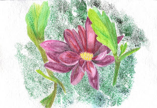
The photo reference was posted on Watercolor Painting Techniques yahoo group for a March project. Since I'm currently in Kate Johnson's watercolor pencil class, I figured this would fit the lesson on flowers! I used Derwent Inktense watercolor pencil on Lama Li paper. The background is a technique I read about in a Karlyn Holman book where you wet the watercolor paper and then sand the pencil tips with 100 grit sand paper. It's really fun and easy! Just cut a piece of sand paper into a square, it needs to be small enough to fit in your cupped hand. Choose the color/colors of pencils you want to use, wet the paper in small segments at a time. Rub the tip of the dry pencil across the sandpaper, that is cupped in your palm -- kind of a funnel shape cup-- and direct the shavings onto the wet portion of the paper. Let it dry and then hold it over a trash bag/can and blow the residue off. Continue on, doing a small portion at a time, be very careful not to wet the part that's already been done or it will run. Surprisinging enough, very little pencil is wasted. I sanded and then tapped the paper and then sanded and tapped again -- repeating in this way kept the pigment from building up on the sandpaper."

The photo reference was posted on Watercolor Painting Techniques yahoo group for a March project. Since I'm currently in Kate Johnson's watercolor pencil class, I figured this would fit the lesson on flowers! I used Derwent Inktense watercolor pencil on Lama Li paper. The background is a technique I read about in a Karlyn Holman book where you wet the watercolor paper and then sand the pencil tips with 100 grit sand paper. It's really fun and easy! Just cut a piece of sand paper into a square, it needs to be small enough to fit in your cupped hand. Choose the color/colors of pencils you want to use, wet the paper in small segments at a time. Rub the tip of the dry pencil across the sandpaper, that is cupped in your palm -- kind of a funnel shape cup-- and direct the shavings onto the wet portion of the paper. Let it dry and then hold it over a trash bag/can and blow the residue off. Continue on, doing a small portion at a time, be very careful not to wet the part that's already been done or it will run. Surprisinging enough, very little pencil is wasted. I sanded and then tapped the paper and then sanded and tapped again -- repeating in this way kept the pigment from building up on the sandpaper."
Thursday, March 06, 2008

Battery Point Lighthouse in Crescent City, CA
Crescent City is in northern CA, at the Oregon border. It rains a whole lot there and so Battery Point is covered with green moss! This is done on Lama Li paper and I used DS paints for the sky and the water and Derwent Graphitint watercolor pencils for the rest. Still working with w/c pencils for my class with Kate Johnson. I'm not real thrilled with this, but have some nice ref photos of Battery Point so will probably do another one or two.
Wednesday, March 05, 2008
 Pt Arena Lighthouse - Second Attempt
This is a redo where I applied the suggestions made by Kate Johnson in the watercolor pencil class. I raised the waterline to be a little bit above the landline and lowered the lighthouse so it wasn't topping the edge of the paper. This one is not totally done in watercolor pencil. It is DS Watercolor paint and Derwent Graphitint pencils done on Lama Li paper. The only area where I used the pencils is the cliff, the rest of it (including the rocks in the water) were done with tube paint. I was pleasantly surprised at how well the pencils worked on the Lama Li! I really, really like the graphitint pencils for certain subjects and I like my Lama Li!! What a wonderful union - LOL.
Saturday, March 01, 2008

Pt Arena Lighthouse
Lesson 3 of Kate Johnson's watercolor pencil class. Done on Arches CP block using Derwent Inktense Pencils and Derwent Graphitint Pencils. This scene combines our exercises for lesson three which is water, skies and rocks. I've combined a lesson with a challenge because in WetCanvas, there is a March challenge to do lighthouses. When I read about that challenge, I immediately thought of Pt Arena Lighthouse which I've been to and even climbed to the top! It was interesting, exhausting (ha) and an awesome view!! This lighthouse is located in northern CA and sits on the San Andreas where that fault enters the Pacific Ocean. The great San Francisco Earthquake of 1906 destroyed the original lighthouse and it was rebuilt in 1907. It is 6 stories tall. You can see some awesome aerial shots of it and read more about this interesting lighthouse here http://www.mcn.org/1/palight/
Tuesday, February 05, 2008
 Watercolor Pencil Class with Kate Johnson
Lesson 1a
This is done on Strathmore Art Paper (pink) with Derwent Inktense watercolor pencils. The water and the sky were done with five light layers. The process was color, followed with a wet brush that had been wicked on a sponge before each stroke, dry thoroughly and then repeat. The sky and the reflections on the water are primarily the pink paper, with a little bit of Chili Red pencil. Tangerine pencil is at the skyline. The pink in the foreground is the only area where the pink is pure paper. The distant trees and mountains were a single, heavy layer of a combination of Ink Black, Deep Indigo and Bark which I used a wetter brush on and drug the pigment into puddles and also into the skyline to get a jagged edge. The foreground is a light coloring of Bark on the ground and a combination of Deep Indigo and Ink Black on the blades of grasses. Light water was applied to the foreground. I'm pretty satisfied with this, especially since it's the first watercolor pencil I've done in months and months! The reference photo is from the reference library on WetCanvas and can be viewed here http://www.wetcanvas.com/RefLib/showphoto.php?photo=34786&si=southwest
Friday, January 25, 2008

Revised!
Doug at WetCanvas gave me some good instruction on fixing the spot of sun. Then I realized that the tree trunk needed to be more shaded, after all the sun is on the other side. One of those "slap myself on the forehead" revelations! I'm much happier with this. . . not perfect, but improved.
Thursday, January 24, 2008

Jazz Alley Triad 4 - Winter Scene 2
Another one using a photo ref from the WetCanvas January challenge for winter scenes. This is done on Arches CP block, 7 x 10. I was pretty happy with most of this, I'm not sure about the sun spot shining through the branch of the tree, though. It was a very nice aspect of the photo. . . Maybe I didn't do it correctly. I masked the circle, painted the sky and the tree branch. I let it dry completely and then removed the mask, I used a wet brush to soften the edges. While that area was still damp, I dropped in just a haze of the brown/rust and then let it dry. I followed up with some strokes using the same pigment mix. It just looks "funny" to me, like it doesn't fit.
I AM enjoying using this triad and am getting somewhat accustomed to having no green - ha ha.
Wednesday, January 23, 2008

Jazz Alley Triad - Winter
This is from a photo on WetCanvas. It was posted along with two other winter scenes that were a January challenge. I decided to try this one using the triad. Since there's no green or yellow, I made the evergreen trees rust - :) I have to admit, I'm getting obsessed with this triad. I find it VERY challenging!! We are supposed to get snow where I live tonight and tomorrow, so maybe I'll be able to get out and take my own "winter" photos.
It is painted on Arches CP block and is 7 x 10.

Jazz Alley Triad - Bee on Lavender
I'm still searching for subjects to paint using JUST the pigments in this triad. I've found a few flowers and insects to add to my sunrise/sunset photos. I am finding that I REALLY need my yellows - LOL! After I finished this, I realized that for this lavender sprig a light grey would've been more effective to portray the fuzzy coating of the lavender pods. I just might attempt this one again, it was fun to do the bee. I think this may be the first insect I've ever painted.
Tuesday, January 22, 2008

Daniel Smith's Jazz Alley Triad - Desert Sunset
WetCanvas has an upcoming challenge for February to paint something using ONLY the DS triad called Jazz Alley. I've never participated in a WC challenge and thought maybe I'd try this time. The triad is challenging in itself! The pigments are Indigo, Quinacridone Sienna and Deep Scarlet. So, there's NO green and there's NO yellow to make a green! I can mix up some nice lavender and a nice range of terra cottas, but oh my! this challenge is going to be challenging in just finding subjects. Sunrises/sunsets will fit the bill, so that's what I've attempted here. I poured the sky (my first pouring experience) and then when I painted in the mountains, the sky was still damp and so I got runs and my mountains looked like volcanoes erupting - LOL! After the paper was completely dry, I tried to give some solid shape to those eruptions!! Rather than completely covering the runs, I decided to leave the tops just because they were unexpected. I hardly ever have the opportunity to use my rigger brush and really love it - it was fun to do the bare tree with such a fine tool!
Thursday, January 17, 2008

Watersoluble Graphite Sketch with Watercolor Pencil
I couldnt' resist. . . I had to see what would happen when I added COLOR! I used Derwent Inktense Pencils and found that the graphite did reactivate just a little bit when I added water to the watercolor pencil lines. After it was completely dry, I touched up some of the graphite lines and then dabbed a bit of water on them. This was a fun experiment and now I'm REALLY eager to see what the graphite does with watercolor tube paint.

Watersoluble Graphite Pencils
I bought a set of these pencils (Cretacolor) back in July and had not even given them a test run yet!! Yesterday my friend, Irene, and I went to DBs in Pasadena and I talked her into buying some and so figured I probably should try out my own set - LOL! Last night I drew this simple little still life using the 4B pencil. After the initial drawing, I wet it with a brush and water and let it dry completely. Then I used the 8B pencil to add some darks and brushed those areas with water. Once water is added, the graphite is "set." When water is added, the lines just instantly melt -- it's really neat! Now that I've given this new/old toy a test run, I'm eager to try something a bit more complex. Kate's watercolor pencil class starts in a couple of weeks, so I'm gearing up for that and now am wondering what would happen to do a mixed media with these pencils and watercolor pencils or tube watercolor -- the graphite could certainly be effective as an underwash for shadows!!
Here is where I bought my set http://www.fineartstore.com/Catalog/tabid/365/List/1/CategoryID/13320/Level/a/Default.aspx
Monday, January 14, 2008

I just got a new "toy!" It is Derwent Tinted Charcoals and they are watersoluble. Currently, they are only available in the UK and I ordered them here www.artifolk.co.uk
This is just a quick little scene I did to give this new toy a test run. The background mountains were drawn and colored in using a variety of the charcoal tints, then water was added with a brush to blend. The sky is DS watercolor and the lake is a combination of the tinted charcoals and DS watercolor, as is the foreground. It is done in my Raffine sketchbook.
The charcoals go on just like regular charcoals, and they blended very easily when I added the water. As you can see, they don't completely dissolve, which I rather like as it adds a neat texture. I like how the combination of the charcoals and paint worked to give a sense of depth in the lake. In the foreground, I drew the grasses with the charcoal and then washed over them with watercolor. I look forward to working with these pencils again!
Sunday, January 06, 2008

SF Golden Gate
My final gate in the series. This one, which should be simple, caused me so much frustration! This is the third attempt and it is still no where NEAR what I had in my head - LOL! It's a bit different than my other gates in it's subject, but I thought since I'm a Californian, I best do THE gate of all gates that we seem to be rather known for. It is done in my Lama Li book and I used all DS paints. I bought the DS set called Color Map Mixing Set - which is 10 tubes that give INCREDIBLE mixes. You can see the color chart on my flickr here
I think I'm going to enjoy working with these pigments.
This morning I got an idea for my next series and I'm really excited about it! It will be "clouds." I've done some research online for some ref photos and there is TONS of really terrific shots of all kinds of clouds. . . I am eager to start.
A side note. . . my friend, Lin Frye, of http://viewfromtheoak.blogspot.com/ recommended a book and dvd to me a few weeks ago, "Watercolor, The Spirit of Spontaneity," by Karlyn Holman and it is fantastic. Karlyn has such innovative ideas and techniques, so I may be implementing some of her techniques in the next series. If you are interested in this book, you can find it here www.karlynholman.com
Tuesday, January 01, 2008
2008 ART GOALS
Stuffed French Toast Casserole This is a photo I took of one of the Christmas Breakfast dishes I make. It is a family favorite that I absolutely MUST prepare each year, at least according to my DH, DS and SIL! We women like it too, but the men practically fight over getting their fair share. It is appropriate to post today because it represents one of my art goals for 2008. Speaking of goals, I've finally fine-tuned my list. This year, I am wiser and remembered to work on ALL my goal lists at the same time so I wouldn't get carried away in just one area of my life. I prefer goals over resolutions, resolutions always seemed to set me up for failure. Or rather, I set MYSELF up for failure. The pastor of my church has a saying (and I don't remember who the original author of this is) and it is "he who aims at nothing hits it every time." That really sums up goal setting for me!
Here's my 2008 Art Goal List:
1 - Set up a Food Blog that will be illustrated with sketches/paintings/photos. Publish the blog for Christmas gift giving. If I don't have it complete for Christmas 2008, then I'll shoot for Christmas 2009. For years now I've had family and friends urging me to write a cookbook. Ronell's http://myfrenchkitchen.wordpress.com/ is my inspiration to do this cookbook in a blog format. Thanks, Ronell!!
2 - Continue participating in the "painting a week" group that was started off of Kate Johnson's alumni group.
3 - Continue working through art books, dvds, and online classes.
4 - Get out and do more plein aire.
That's it!!
Happy New Year to each and every one of you! Here's wishing us all a very blessed 2008!!!
Stuffed French Toast Casserole
 This is a photo I took of one of the Christmas Breakfast dishes I make. It is a family favorite that I absolutely MUST prepare each year, at least according to my DH, DS and SIL! We women like it too, but the men practically fight over getting their fair share. It is appropriate to post today because it represents one of my art goals for 2008. Speaking of goals, I've finally fine-tuned my list. This year, I am wiser and remembered to work on ALL my goal lists at the same time so I wouldn't get carried away in just one area of my life. I prefer goals over resolutions, resolutions always seemed to set me up for failure. Or rather, I set MYSELF up for failure. The pastor of my church has a saying (and I don't remember who the original author of this is) and it is "he who aims at nothing hits it every time." That really sums up goal setting for me!
Here's my 2008 Art Goal List:
1 - Set up a Food Blog that will be illustrated with sketches/paintings/photos. Publish the blog for Christmas gift giving. If I don't have it complete for Christmas 2008, then I'll shoot for Christmas 2009. For years now I've had family and friends urging me to write a cookbook. Ronell's http://myfrenchkitchen.wordpress.com/ is my inspiration to do this cookbook in a blog format. Thanks, Ronell!!
2 - Continue participating in the "painting a week" group that was started off of Kate Johnson's alumni group.
3 - Continue working through art books, dvds, and online classes.
4 - Get out and do more plein aire.
That's it!!
Happy New Year to each and every one of you! Here's wishing us all a very blessed 2008!!!
Thursday, December 20, 2007

Sunset Gate
Done on Lama li using Holbein paints. The paints are in a seminar palette put together by Holbein for Tom Lynch -- pretty neat little set that I'd not used since the workshop I took in September. This is my very first attempt at painting the Sun. I found the reference photo at Yotophoto. I usually don't paint this dark, so that's a couple of new things for me. I don't know if it's the Holbein paints or if it was because of the pigment rich mixes, but it sure took a long time for each section to dry!
Tuesday, December 18, 2007
 Gate 7
Off Kilter Gate. Lama li paper and DS paints. I used DS Kyanite Genuine over a mix of sepia, UM, and Quin Red to get the blackish asphalt and deep shadows inside the fence. There were several challenges with this painting. I masked the gate and the top of the fence and discovered that masking does NOT work well with Lama li - the paper pulled off with the mask. What a mess that was!! Rather than trashing the piece, I decided to just fix it as best I could. I have a limited palette of DS so many mixes were made! I don't mind mixing, actually I enjoy it, but I found that I'm lacking in some basic pigments that would've made mixing much more effective, if not easier. Hmmm, I wonder if DS has "after Christmas sales." I like DS paints, but find that I still favor WN so not sure if I should invest in more DS or not. And truly, there is no reason why I shouldn't mix the two!! LOL!
Monday, December 17, 2007

Gate 6 - Rusted Gate
Done on Lama li with WN paints. The barn came out too dark and I tried to lift some pigment. Lama li doesn't lift too well, it starts to peel! This was done very quickly, I'm trying to get a looser look and not fuss with it too much. I like how the posts and the gate came out. . . well, except for the scroll work on the top of the gate, not crazy about that part!! I'm still enjoying working on this series.
Tuesday, December 11, 2007

Gate 5 - Winter Gate
This is my first attempt at anything "snow." It was actually more work than it looks -- very difficult trying to define the shapes of the snow clinging to the branches of the tree was a challenge. For a first attempt, I'm pretty happy with it. I'd like to try some more snow scenes. I used Cerulean VERY WATERED DOWN and then did some outlines in a cool gray that I mixed. Now to decide on the next gate.
Wednesday, December 05, 2007
 Gate 4
I really liked the reference photo for this (found on Yotophoto), but it's one of those where the painting didn't live up to what was in my mind. It just seems "flat" to me and I'm not sure why. I'm not going to try to fix this, I'm just going to "keep on keeping on," and I'm real inspired to start the next gate in my series. This was done on Lama li (I think I'm going to do all of these gates in my Lama li book) and I used all WN paints.
Tuesday, December 04, 2007


Easy - No Sew Throws for Christmas!
I've made four of these for Christmas gift giving and plan on doing at least two more. Here's how!
Purchase 1 1/2 yards each of fleece in a print and a solid OR you can do two coordinating prints or two solids -- doesn't have to be a Christmas print. Trim the selvages off of each piece of fleece. Lay out the the pieces with wrong sides together and make sure they are the same size - some trimming may be in order. Using a piece of 2" x 4" cardboard for a template, cut through both pieces of fleece making 2 inch wide and 4 inch length "fringes." On the corners, you will cut out a 4" x 4 " square. Tie the front to the back by tieing each "fringe" into a square knot. I cut one side and tied it and then cut the next side and tied it and so on -- it broke up the cutting and tieing and helped to rest my fingers. The finished size is approx. 46" square and it took me right at 1 hour from start to finish!
Monday, November 26, 2007
 Gate 3
Well. . . ANOTHER lesson learned! I had visions of a clean, crisp metal gate with wonderful golden rolling hills behind it. I very mistakenly thought my Sepia Pentel Brush Pen was waterproof. . . thought I'd checked it out months ago when I purchased it. The first step I took was to use this brush pen on the metal gate, after all it would make it so much easier to paint the rolling hills in the background if I could just paint right over that gate - LOL! As we can all see, as soon as I started painting that sky, I had BLEED!! Rather than trash this little scene, I decided to continue painting it anyway and to just chalk it up as another lesson learned. So here it is!!
Sunday, November 25, 2007

Gate 2
My immediate goal with painting is to have fun. I'm not striving for perfection, I'm just "playing." As I started painting this gate, it occurred to me that I had goofed BIG TIME on the first gate and all of my online art buddies were too kind to point it out. Well folks, I realize now that I had mixed up my cool and warm placement and put the cools in the foreground and the warms in the background - Yikes!! What in the world was I thinking. . . or rather NOT thinking!! LOL!!
This gate is from a ref photo I found on Yotophoto and it is of a gate at Stevens-Coolidge Place, Andover, MA It is done on Lama li and I used all WN paints. One major flaw I see is the rock fence on the right looks like it's on the ground -- just didn't get the perspective right or something on that. Possibly it's fixable, but I'm ready to go on to the next gate!!
Wednesday, November 21, 2007
 Gate 1
I've been away from my blog for far too long! Several reasons why. . . my daughter, who lives in Las Vegas, had her first baby on Oct 27. A beautiful little girl they named Katie after my mom. I stayed with them for three weeks to help out. What a joy it was!! Another reason I've not done art is simply because I ran into a HUGE creative block. Actually it was more than a block. . . I really questioned WHY I spend time on something that will not bring any financial gain and that I probably won't even use as a tangible gift to friends/family! While in Vegas, I had one of my periodical read-a-thons. I read 8 novels, which I enjoyed immensely. As I was reading, it occurred to me that reading is not going to bring me any financial gain and it's not producing a tangible gift! So, if I'm willing to spend time on reading, why is it that I'm guilt ridden with time spent on art? I learn things when I read, even it it's fiction. I learn things when I do art, especially when it is nature---intense observation brings knowledge. So I started looking through some of my art books with a freedom that it's OKAY to do something I enjoy just for the pure pleasure of it all! I got inspired to work through another book, then I got inspired to work on a series. I found some good reference photos for gates that got me excited and so this is my first gate. It's done on lama li and I used all WN paints.
Thursday, October 04, 2007

Huntington Gardens - Agapanthus Path
This is my second attempt at this scene. The first was posted in July. I wanted to try it again and think I've gotten a better sense of depth. I also wanted to see it in a higher key. It was painted on Arches CP block using DS paints. I think the canopy of greenery is wisteria and I would like to paint this same view when it is in bloom---the agapanthus will not be in bloom, but the hanging wisteria should be just beautiful!
Sunday, September 09, 2007


Cedar Wood Journal
Yesterday I went to a class at the Huntington Gardens to make this journal. This is my first experience with any kind of bookmaking and it was an absolute delight! The teacher, Wendy Poma, did a fantastic job of teaching. About half of the class were ladies who had taken some of Wendy's other classes and the other half of us were newbies! Wendy is phenomenal. . . she had prepared the materials ahead of time and each work station had every single thing we needed to make our journals. She even cut all the paper, the cardboard pieces, the faux suede - and we had a pile of cedar tiles from which to custom choose our very own. She laid out beautiful papers for us to cut for our cover sheet -- lovely colors and designs, as well as decorative paper punches and embellishments. It would take PAGES to describe step-by-step how we did these journals, so I'll just put it in a nutshell. The heavy cardboard front and back were covered with faux suede CONTACT PAPER - can you believe such a thing exists? It is amazing to work with and really feels and looks like suede. It comes in a roll - just like regular contact paper. Wendy got hers at The Container Store in Pasadena, but she said she'd heard that Lowe's carries it. Then we covered the cardboard spine and then using 1/4 inch super sticking double stick craft tape (NOT scotch tape) we attached the spine to the covers. Using the same double sticky tape, we laid five rows of strips down on the front cover and placed our cedar tiles - VERY carefully and then pressed firmly into place. We used water based varnish to finish the cedar tiles. Wendy had cut all the paper and each of us had enough to make two "pads" for our journals. We got our stacks of paper (with a light cardboard on the back and our decorative cover paper on the front) into nice, neat stacks and then held them together with large binder clips. Then we painted on a nice substantial layer of "Padding Compound" onto what would become the spine -- and this is really cool. . . we moved the binder clips to the padding compound painted side and then set our stacks upside down using the grippers of the clips as legs -- how cool is that? The padding compound is thick and doesn't run easily, but setting it upside down assures that it won't run too far into the pad. The next step was to use strips of the faux suede and wrap the "pad" of paper and then decorate the cover sheet however we wanted. One pad was glued (with strong glue stick called UHO) onto the inside back cover. When the pad is filled, you just grip it and pull it off of the back cover and then you can glue in the refill.
I did a google on "padding compound" because I really want to use it for making watercolor journals and found it on Amazon as well as several other places.
If anyone lives in southern CA and would like to take a class from this incredible teacher, she has classes on Sept 22 to learn Embellishment Techniques and More at Mimio in Pasadena (phone number 626-685-9090) and on Sept 29th is a class on Double Slide Closure Journals at Stampin' From the Heart (phone number 310-391-0466). Then on Oct 6th at Vroman's Bookstore in Pasadena (phone number is 626-449-5320) is another class on the Double Slide Closure Journal, on Oct 13th at Descanso Gardens a class to make an Organizer Journal, (phone number is 818-949-7981). She also has an all day Embellishments Class on Oct 27th at Stampin' From the Heart (phone number 310-391-0466). In November, on the 3rd is a Pleated Spine Journal at the Univ. of CA, Riverside (phone number 951-827-1637) and on the 10th of Nov a class to make Three Gift Books at Glendale Community Collegee (phone number 818-240-1000 ext 5015).
Thursday, September 06, 2007
 Kate Johnson's online watercolor 2 class - week 4 is on Weathered Wood, Lichen and Moss. This is my "moss" exercise done on Cotman 8 x 5 watercolor pad using WN paints. Some of this is wet-in-wet and some is dry brush. The slim portion of background (on the right) is darker in real life, don't know why it didn't scan true--the rest of it scanned just fine. I guess some pigments are more reflective? I've done trees and tree trunks before, but this is my first "moss." I am pleased with the result, but we'll see if Kate suggests any improvements. It's always amazing how she can find things that can be improved upon--usually just a little bit here or a little less there.
Thursday, August 30, 2007

Week 3 - Kate Johnson's online watercolor class
This week's lesson is on "Earth, Pebbles, Sand, Rocks, Grasses and Weeds" and the reference photo I used is from Death Valley. I painted this on a Cotman sheet and it is 8 x 5. It sure was fast and easy to paint of this paper after working on the canvas and the hot press recently!! The pigments used were all WN and they were Burnt Sienna, Payne's gray, Indigo, Raw Umber, Sap Green, Cad Yelow Pale and Cad Orange. I masked the little plant, then I washed the background and then used several colors for wet-in-wet splatter. After the rocks were painted, and before I removed the mask, I dry splattered very finely with a toothbrush. It was a fun exercise and I enjoyed working on something rather simple.
Monday, August 27, 2007
 Watercolor 2 Class - week 2
Week 2 of Kate Johnson's online watercolor class was about water, reflections, and foliage. The reference photo for this was one I took of a pond at Butchart Gardens. It was done on Arches block, hot press, 7 x 10. I absolutely love Arches blocks, but am not crazy about hot press paper. But, like many materials I don't care for, I am determined to try, try again!! This project was tedious - I used multiple layers of glazing in many areas and it was almost entirely done wet-in-wet. The foreground is supposed to be waterlily pads -- a plant I am very fond of and have not been successful (either here or on other works) at getting the foliage to look like what they are supposed to be!! On a positive note, I was pleased with the variety of greens I was able to mix - another of my weaknesses that I really worked on here.
Saturday, August 18, 2007

Kate Johnson's Watercolor 2 Class - Lesson 1b
Now THIS was fun!!! It's done on Yupo, which I haven't worked with in MONTHS and it was just a delight. Same reference photo and same DS paints as the one done on Canson--what a difference that Yupo made. For those of you not familiar with this strange watercolor "paper," it is not paper at all, but plastic. The paint obviously cannot soak into the plastic and so it just kind of floats and flows basically wherever it wants--I DID control some of it by tipping the sheet. I'd never tried salt on Yupo, so this was a first. I did the water first and loved the salt on it so much, I repeated that technique on the greenery of the mountains. The other technique I used is a bit of spatter on the mountain on the left. I used DS Buff Titanium for the misty clouds and dropped some pigment down on the mountain tops after they had dried completely. Since Yupo is plastic, it's a bit tricky to add layers because as soon as you put a wet brush on the dry area, the existing paint rewets and wants to run all over again. I did this tricky "layering" on the water also. I love the darker areas on the mountains and those were created simply by letting the paint flow and settle -- just a little coaxing on my part by tipping the paper. This affect is purely a Yupo kind of thing, which is why I really delight every time I use it. It certainly makes me loosen up any "control issues" I have with my painting. LOL!!
 Kate Johnson's Watercolor 2 Class - Lesson 1
This week's lesson is on the four "S's" -- spatter, scrape, salt and sponge. The reference photo, taken during the Alaskan cruise my dh and I took at the beginning of this month, is of a misty fjord. This version is done on Canson watercolor paper and the techniques I used were sponging, scraping and salt. It was done with DS paints, which are just yummy!! I had some struggles with this and it DOES look a bit overworked. I used DS Buff Titanium to try to get the misty clouds at the mountain tops and got a bit more "run" than I wanted. Sponging in the greenery was tricky as it was such a small area to try to control that sponge in - ha ha. I DID tear the sponge up into small pieces, but oh my!!
Thursday, August 16, 2007

My friend, Lin, over at View From the Oak gave me this award! LOL! I don't know how "rockin" I am, but I'm flattered she thought so!! Here's how the game works. . . I need to give this award to four of my friends. All of their blogs are on my blogroll, please do pay them a visit!!
Irene, who was a blogging art buddy and moved to a MERE 6 MILES FROM ME so now we are face-to-face art buddies! Check out her wonderful blog, Just Crazy About Dogs.
Mary, at Emma Pod blog, we share a past life of working in the medical field and therefore having a rather sick sense of humor sometimes!
Andrea, who lives in Wales and reminds me so much of an old, dear friend whom I lost to cancer several years ago. I always smile when I visit her blog, Andrea Joseph's Sketchblog, and see her invitation to share a cup of tea!
Casey, from rue Manuel bis blog, is a huge art inspiration with her ink and loose watercolor style that I envy so!
So ladies, you are hereby Rockin' Bloggers!!
P.S. I don't know if I did it right, but it worked. . . I saved the photo icon in My Pictures and then uploaded it to my blog.
Wednesday, August 01, 2007
Alaskan Cruise
My dh and I are off tomorrow morning for a cruise to Alaska. I'm taking some art supplies and plenty of SD storage for my camera! We fly from southern California to Seattle tomorrow and then set sail on the 3rd. I'll have time in Seattle tomorrow afternoon to grab a taxi and take a trip over to the Daniel Smith store -- I just might be as excited about THAT shopping excursion as I am about the Alaskan excursions!! I'm looking forward to all the sightseeing and with our hot summer temps, I'm also looking forward to coolness.
We'll be celebrating my birthday while we are gone--actually we'll be in Victoria on that day and Buchart Gardens is on our schedule. So YIPEE!!
My dh and I are off tomorrow morning for a cruise to Alaska. I'm taking some art supplies and plenty of SD storage for my camera! We fly from southern California to Seattle tomorrow and then set sail on the 3rd. I'll have time in Seattle tomorrow afternoon to grab a taxi and take a trip over to the Daniel Smith store -- I just might be as excited about THAT shopping excursion as I am about the Alaskan excursions!! I'm looking forward to all the sightseeing and with our hot summer temps, I'm also looking forward to coolness.
We'll be celebrating my birthday while we are gone--actually we'll be in Victoria on that day and Buchart Gardens is on our schedule. So YIPEE!!
Thursday, July 26, 2007

Lidzey exercise.
I did this simple painting THREE TIMES! It really gave me some fits. Then. . . when I finished it, I realized I hadn't done it as directed in John Lidzey's book, "Watercolour Workshop!" It was supposed to be a small area of my garden (which it IS) and using only Fr UM, Cad Red, and Cad Yellow (which it ISN'T). Actually, I didn't use ANY of those pigments -- aaghh. I think I did do the first two correctly, but it was weeks later that I finally did this one and I erroneously did not re-read the instructions. Ah well, I actually like this one the best. I'm still striving to get dimension and depth and also a looser style. This was a very quick sketch and an equally quick watercolor--lots of wet-in-wet and I pretty much let the paint have it's own way. I was busy with some other things around the house that enabled me to leave this alone while each layer dried thoroughly. I know some watercolorists do not use black, but I like black and I used it--just little itty bits dropped in to give depth to the underbush part. The white blossoms (it's an oleander bush) were masqued out to protect the white paper during the painting. Then after removal of the masque, a very pale wash of cobalt blue was dropped in here and there to give some shading.
I'm excited that Kate Johnson is offering a Watercolor II course online and, of course, I was one of the first to sign up! We will be using her book, "Creating Textures in Watercolor" and I'm very much looking forward to getting started on Aug 12th. I'll try to get a few more exercises done from the Lidzey book before then.
Monday, July 23, 2007

Agapanthus Path at the Huntington Gardens
Life has been busy and kept me away from art for a month! It felt good to fill up my water containers and dip those brushes again. Irene, from Just Crazy About Dogs blogspot, and I went to the Huntington Gardens last Thursday and then to Dick Blicks - talk about a wonderful "art date!!" I did attempt a plein air at the gardens, which I'll not post here - ha ha. I took some photos and this lovely path was a photo I took. It is on Lama li.
My home remodeling is done, I still have to touch up the paint on the baseboards and also need to paint a bathroom. I am so happy with the end result and am anxious to get the final decorating items in place.
Subscribe to:
Posts (Atom)