Wednesday, April 18, 2007

Pike Exercise 11, Mykonos Church

Mykonos Church is in Greece. This one was more fun than I thought it was going to be. I was dreading trying to get an animal in this that looked remotely like a donkey, but it wasn't as difficult as I thought it'd be. Very limited palette was used again, I guess John Pike liked those limited pigments and mixing and mixing and more mixing! I did use mask to protect the upper areas of the building from the sky and was able to try out a "rubber cement pick-up" that I recently purchased from Dick Blick's. What a neat tool!! No more tender fingers from rubbing that stuff off.

Wednesday, April 11, 2007


Pike Exercise 10

John Pike called this "Venice, Mother and Chicks." This is one exercise that I almost gave up on several times. I'd wait a while, look at it and then add a few strokes here and there. It's not my favorite, however I did learn from it. The sketch is much looser than I usually do, which made it difficult for me. The steps and techniques for painting the building were new to me and I did enjoy them. I think I'm getting better at portraying water and the reflections and I'm not as fearful of loose sketches of figures. Several pigment mixes were used, primarily Pike's favorite French UM and Burnt Sienna and French UM and Burnt Umber - both in varying ratios to get the different values. I'm really getting comfortable with mixes! Also, I'm sticking with using flat brushes and am getting more confident with those.

Saturday, April 07, 2007


Pike Exercise #9

This is called Dubrovnik, Old City and is of a coastal village in Yugoslavia. This was a bit time consuming, especially the architectural sketching. I DID cheat a little bit by drawing it on a grid, of course, I'm not sure that would technically be considered cheating. The past several Pike exercises have been rather gray and I didn't post #8 here or on my flickr as it was such a disaster. I tried it twice and decided I basically just didn't really like the scene. I love to learn and I love challenges, but when my art becomes too much like "work," I'd just as soon pass it up - ha ha. I have decided that I absolutely LOVE Arches blocks!! I do NOT like the hot press, though. I just got some Arches rough that I am anxious to try.

Wednesday, March 28, 2007

Pike 5

This exercise is called Irish Clouds and was the fastest Pike exercise I've done thus far. I didn't time it, but I think it took about 30 minutes. It is done with only two pigments, French UM and Burnt Sienna. I'm beginning to think these were John Pike's favorite pigments as all of the exercises I've done so far have used them. It was done on Arches cold press block, which I'm becoming VERY fond of! This was done without any sketching whatsoever - which was a first for me! Also, I'm using flat brushes and while I'm not as comfortable with them as I am with my beloved rounds, I feel I'm getting more confident with them.

Saturday, March 24, 2007


Pike Exercise 4

Abandoned boat done on Arches Hot Press. This is the first time I've ever used hot press and I'm not sure if I like it or not. It's smooth like the bristol that I love, but the paint didn't go on as smoothly - not sure why. All in all, I'm not very happy with this for several reasons. First, I don't really like the scene that much and second, I don't particularly like the colors. I didn't get a good "roundness" to the hull of the boat and the broken parts were difficult for me to portray. From a positive standpoint, I like the distant shoreline and I like the looseness - something that is VERY difficult for me.

Friday, March 23, 2007


Pike Exercise 3
As I continue on through John Pike's book, this exercise was the most time consuming and difficult thus far. It is a night scene of Burano, a small island near Venice. Although it's not the type of scene I'm fond of, I did find the different elements to be interesting and challenging. John Pike explained that the moonlight is reflected and bouncing - the moon would actually be behind the viewer; and to complicate the light in the scene more, there is the light from the shop window and an unknown light source coming through the archway on the right. The sidewalk and cobbled street are supposed to be wet. Whew - I don't know if I got all these elements right, but it was definitely a learning experience.

Wednesday, March 21, 2007


Pike 2

This is my second exercise from John Pike's book. It's supposed to be a snow scene (in case you can't tell - ha). John Pike's grays were actually darker than mine and yet his looked like snow. Maybe I need to have more variation in the gray and also more drift patterns. I like my foreground trees and was pretty happy with the people. I've always avoided putting figures in landscapes and found it not quite as daunting as I expected.

Tuesday, March 20, 2007

Pike 1

I've started working through "John Pike Paints Watercolors" and this is the first exercise. There's lots wrong with this. . . but there are a few things right - ha. I really like how the tree trunks turned out, particularly the one in the foreground. I recently purchased an Arches block and this was the first painting I've done on it. I really like how the paint flows on this paper, particularly wet-in-wet -- the tree trunk I like was done with a very watery wash of gray made from French UM and Burnt Sienna, then while it was still wet, cad yellow was dropped in on the sunlit sides and an itty bitty bit of cad red was dropped in along the center, then a heavier concentration of the gray dropped onto the shaded side. After it was dry, an even heavier concentration of the gray was dry brushed and then a very small amount of dark green was dry brushed. I have a tendency to grab my #6 round and really need to start grabbing a larger brush! I'm looking forward to the next lesson in this book!

Friday, March 16, 2007


Coastal Village
This was the workshop project on Art Academy Live last week. The scan on the bottom was my attempt during the workshop. The teacher, Sterling Edwards, has a much looser style and also his pigments weren't as saturated as mine. This was supposed to be impressionistic! My second attempt (the scan in the middle) was sketched with my new Pentel Brush Pen (NOT the Pentel Pocket Brush Pen) and the ink is brown and I found out REALLY fast that it is NOT waterproof! Wasn't happy with that one either, although it was fun to try the new drawing toy out. So I tried a third time and while it's not as "free and easy" as Sterling's, it is an improvement over the other two. I think I'm done with trying this scene. All three of these were quite a struggle for me, and while I like to see a bit of impressionistic work, I don't seem to be able to get the looseness required to pull it off. Ah, must be one of those "practice" things.

Saturday, March 03, 2007


Sunlit Canyon

Yesterday, I took an online watercolor workshop through Art Academy Live. Basically, it's an interactive live streaming video class. A supplies list is provided to enable the student to prepare for the class. On the date and time of the class, the student logs in and is directed to the classroom. There is the artist/teacher/demonstrator and also a moderator. If students have questions during the workshop, they type the question on their keyboard, the moderator reads the question and the instructor answers the question. Very slick! The classes are from 75 to 90 minutes long and the time flew like it was only 20 mintues! I had my palette loaded, paper ready, brushes laid out and was still hustling to get my painting done. It didn't turn out very good, so I redid it today and the redo is the one I've posted. This was an excellent exercise for me on painting without sketching, using flat brushes (I'm REALLY partial to rounds!) and mixing colors on the paper rather than on my palette. I think I have a better grip on saving whites, having the lightest and darkest areas next to each other for the center of interest and creating the look of sunlight on rocks and vegetation. If anyone is interested in checking out these workshops, go to http://www.artacademylive.com/

Tuesday, February 27, 2007


Cat on Post

This was done on bristol with Derwent Graphitint used for the post and the fence and Albrecht Durer watercolor pencils for the rest. This was difficult and I'm not very happy with it. I decided to quit fussing with it and just post it! LOL! I think there are 4 layers on the cat's body, just couldn't get it to come out like I wanted. Onward I go with working through Kate's book.

Wednesday, February 21, 2007


Horse

This was done on bristol paper using the Albrecht Durer watercolor pencils. I found the reference photo on WetCanvas. I'm in the chapter on painting animals in Kate's book, "Watercolor Pencil Magic." I chose a photo that was just a head shot rather than the full body of the animal because I'm not very confident that I could get the whole body drawn with correct proportions. I've never really been around horses during my life, but I've always thought they were such majestic animals. The few I have been around were very old and gentle. I think this horse has a very gentle look about him!

Monday, February 19, 2007


Watercolor Pencil Rose

I just got a set of the Albrecht Durer watercolor pencils and a Richeson atomizer, so this is the first thing I've done using them both. The AD pencils are fabulously creamy, even on this Cotman paper - I'm rather anxious to try them out on bristol! The atomizer took a bit a manipulating, but I finally realized the tubes slide and they must be in just the right position for it to work. At first I tried to use the atomizer in one of my palette wells, THAT was awkward and messy!! After a bit of thought, I came up with a wonderfully simple solution. I used one of those little plastic water vials that cut flowers come in sometimes. I put the pigment in the vial, put the atomizer pipe in the vial and held it together with one hand while holding up the watercolor pad with my other hand. It gave me much better control and not nearly the mess. Another thing I tried on this, I painted the flower first, then I traced the flower onto a piece of tracing paper, cut out the paper and used small bits of double-sided scotch tape to fasten the tracing paper onto the watercolor paper. Then I sprayed with the atomizer and removed the tracing paper -- I guess this could be considered reverse stenciling. If anyone is interested in checking out an atomizer, here it is: http://www.dickblick.com/zz034/00/

Tuesday, February 13, 2007


Waterscapes done with Watercolor Pencils
The rocks in the waterfall picture were done with Derwent Graphitint, the remaining objects (including the water) were done with Derwent Inktense watercolor pencils. The ocean scene was done with the Inktense only. I REALLY liked the graphitint for the rocks, I used 3 different pigments and colored them dry and added water with a brush. I think the graphitint really added a texture quality. I had some difficulty with the ocean scene - which is from a photo taken by Joe Philipson on the island of Oahu. You can see Joe's photo here: http://flickr.com/photos/jphilipson/307053727/in/set-72157594265577907/
First of all, I really messed up on the sky and on the rocks along the shoreline. I had recently read over at WetCanvas that Magic Eraser (the cleaning sponges made by Mr. Clean) worked well to lift watercolor. Watercolor pencils are actually more permanent than tube watercolors and I wasn't sure if the Magic Eraser would work or not, but decided to give it a try. It DID work, although I had to rub a little bit and did get some slight paper damage. I think a lighter touch would work fine with tube paint and will definitely keep a piece of this sponge in my paint kit!! I cut a small piece off of the Magic Eraser, dampened it with water and then rubbed the area I wanted to remove. I still had trouble with the rain clouds in the sky, even though I did the wet-in-wet technique by wetting the paper and then running a wet brush over the tip of the pencil and then dropping the pigment in. I think this particular seascape would be better if done with tube paint and may try that. I'm ready to continue on in Kate's book, Watercolor Pencil Magic!

Saturday, February 03, 2007


Sandstone Rocks
These were both done with the same watercolor pencils but on different paper. What a difference! The one on the top is Bristol paper and the one on the bottom is Cotman watercolor paper. Both were sketched with Graphitint pencils; the darker lines are Inktense pencil. A wash was applied with DS watercolor (Sedona Genuine) using horizontal strokes to portray the sedimentary layers.

Saturday, January 27, 2007


Watercolor Pencils

I'm continuing to work through Cathy (Kate) Johnson's book, "Watercolor Pencil Magic." This was done with Derwent Inktense Pencils on a 9 x 12 bristol sheet. The flowers were outlined with dry pencil and then a small, wet brush was used to blend the pigments. The vase was lightly colored and blended with a larger wet brush. I have a horrible time with shadows! Although the one on the right is from my scanner as the sheet was too large to fit flush on the flatbed. I'm thinking maybe I should hatch in shadows with a pencil, which I could erase if needed, before I add color. Duh!! Working with watercolor pencils reminds me of those coloring books I adored as a child, where the color was in the paper and it came to life as a wet brush was applied - gee, I wonder if they still make those.

Yesterday was my 33rd wedding anniversary - wow, time certainly does march right along. Our anniversary, except for the milestone ones ie. 25th, 30th, are usually pretty low key. We rather overdid Christmas this year, so a beautiful card, a lovely silver bookmark and a great dinner was the extent of our celebration. Since my dh is pursuing a second career and attending law school at present, we can't do much traveling unless he's on a semester break. I'm so thankful for the 33 wonderful years and look forward to many more!

Wednesday, January 24, 2007


Watercolor Pencils on Yupo

Well this was fun! I am so fascinated with yupo and I'm working through Cathy (Kate) Johnson's book, "Watercolor Pencil Magic," and thought hmmmm, wonder what would happen if I used yupo. So I decided on the simple little ref photo I recently used for one of the gesso experiments. I first sketched the horizon line, the flowers, and vaguely sketched the area of the sky where the light is. I used Derwent Inktense watercolor pencils and lightly colored the whole thing. Inktense is usually very bold - at least on paper! - so I didn't want to apply the color too heavy. Using brushes dipped in clear water, I started blending. I started with the sky and immediately found that I had not applied the pencil heavy enough. While the yupo was still wet, I scribbled in some more color and blended some more. I let the sky dry completely. The swirls appear all by themselves as the water dries. I added more pencil to the foreground (2 pigments were used) and then applied the clear water and blended using up and down "streaking" strokes. I let that dry completely and then I used a very small brush that was damp-wet and lightly stroked the flowers and stems. What I learned: yupo is FUN and watercolor pencils on yupo is even FUNNER!! I think it is the unexpected that appeals to me with yupo - you just never know how it's going to dry.

Monday, January 15, 2007


Gesso Experiments

I saw this technique on WetCanvas. The process is to sketch and then mask the sketch. Apply gesso and texturize it. On the Christmas Cactus, I sketched the blossom and leaves and then masked them. A light coat of gesso was applied to the background and using a 1" flat brush, I brushed in a cross-hatch pattern. The gesso was allowed to thoroughly dry. The background watercolors were applied and allowed to dry. The mask was removed and the blossom and leaves were painted. I didn't think the textured gesso was as prominent as I wanted so decided that two coats of gesso would work better. On the grass with yellow flowers I sketched the flowers and then masked them. I applied two coats of gesso, combing each coat with a plastic hair comb with the intent to have the texture look like grass. The sky was then painted (and here is where I goofed -- too dark on the blue and it wouldn't lift very well). I removed the masking and painted the flowers and leaves. I like the gesso on this one - it turned out just as I wanted. This is a fun technique!

Thursday, January 04, 2007


Grandpa

I recently went to see my family in northern California. One morning, my parents had to go out for some appointments and I jumped at the opportunity to sketch. I wandered around the house and came across a photo of my grandfather. When my parents returned, I showed them my sketch and asked if they knew who it was. Immediately my mom said, "It's daddy." Later in the day, both of my sisters came to visit and when I showed them, they immediately said, "It's grandpa." So, though I know where I goofed, it apparently DOES look like he did. He passed away 42 years ago this past Christmas and the photo was quite faded. It was probably taken of him when he was in his 40s which makes the photo about 65 years old. He was a farmer in Oklahoma. I was only 10 years old when he died, but I remember him very well. He was a very loving and sensitive man. I remember how he tilled the soil with a one-horse plow and oh how I loved to walk along behind him! In the evenings he would sit on the front porch and play his harmonica. To this day, when I hear a harmonica, I think of my grandpa. What a lovely memory to start my 2007 art with.

Sunday, December 31, 2006

2007 Art Goals. I've been pondering. . . and ruminating. . . and just plain thinking for WEEKS about what I'd like to set up for personal art goals for 2007. In March of 2006 I met an online art friend, Lin Frye, who had made a committment to sketch every day of the year. Through thick and thin and all her busyness, she accomplished the task beautifully! Well, it is from her wonderful example that I decided to set goals for 2007. Here they are: 1 - Sketch and/or Paint Every Day 2 - Do All the EDM challenges (this means starting with #1) I'm going to dedicate one journal just for EDM challenges. 3 - Work through the art books in my personal library - "work" them, not just read them. 4 - Start a nature journal. 5 - Use Calligraphy in journals. (I need to restore my old skills!) 6 - Attend at least one Workshop - probably the one in Burbank in October. This list has challenge (every day) but it also has some flexibility. For example, #2 through #5 can really apply to #1. I'm not going to necessarily complete one work each day, but I'm going to WORK on art every day.

Monday, December 11, 2006


Gazebo in the Children's Garden at Huntington Library and Gardens

This was primarily done in watercolor. Derwent Graphitint Pencils were used on the gazebo and the bench. I went to the Huntington last Thursday and had never gone through the Children's Garden -- what a tremendous job they did constructing this area! To get to the garden, you walk through a conservatory. The garden was just delightful!! There were a couple of these gazebos, constructed from iron. The red hearts near the top look like red glass, and they add such a beautiful touch.

Tuesday, November 28, 2006


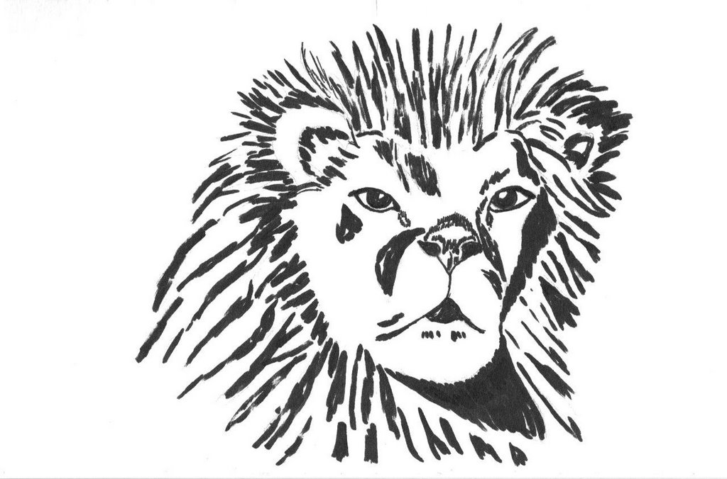
Chiaroscuro Lion

This is my first chiaroscuro. It was done for my online sketching class. It was fun and now I'm eager to try another one, but I'll wait for Kate's critique as I'm not sure this is correct.

Monday, November 20, 2006

Young Koala The wonderful photo for this young koala was taken by Susan at http://www.flickr.com/photos/tiger_empress/ who so graciously gave me permission to sketch this little cutie! He/she is now sleeping on his own, without the arms of mama around him. Thank you, Susan! Your photos are SUPERB!!

Saturday, November 18, 2006


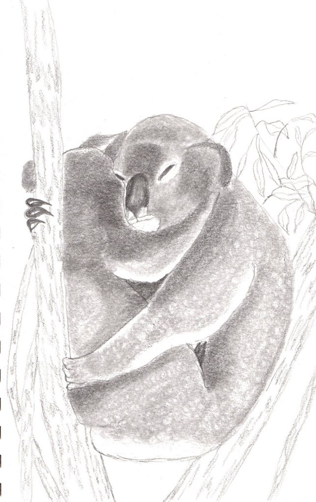
Koala Mama and Baby Sleeping

Isn't this just the cutest pose! I found the reference photo on Yotophoto and couldn't resist drawing it. This is still a work for lesson 2 -- I drew upside down again (LOVE that method!!), plus there were some negative spaces that I watched for and measured against, I used a variety of ways of holding the pencil, and blended in a circular motion using a tortillon to get the look of dense fur.

Friday, November 17, 2006


Tiger

This was drawn upside down - no, I wasn't upside down, the photo reference and my sketch pad were upside down. The object of this lesson 2 exercise is to train one to draw what is seen - not what the brain tells us something should look like. An excellent exercise to stimulate the eye/hand and bypass the brain. I found the photo reference on WetCanvas--such an excellent source for photos!!

Wednesday, November 15, 2006


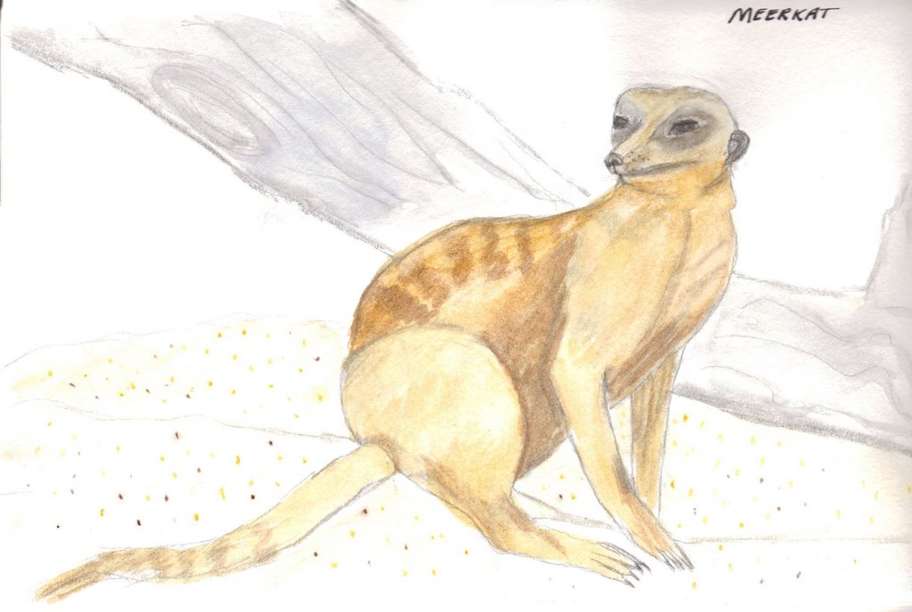
Meerkat

I just love these little creatures! I'm so addicted to the Animal Planet show, "Meerkat Manor." LOL!! I found the reference photo in WetCanvas. This was originally done first as a sketch for my sketching class, then I added light watercolor. This was done in an Aquabee Sketch Pad and it's the first time I've used watercolor in it so I wasn't sure how well it would take water -- it did great, but I did work with a light touch and very little water. The original sketch was a practice with gesture sketching and also negative space (the triangular spaces within the legs). I'm still getting accustomed to my new scanner, the pigments on the meerkat came out pretty true, but the dead tree in the background has a little more detail in real life and the spatters on the foreground are more pronounced. For the spatters, I used watercolor pencils -- just dabbed some random dots and then used a wet brush on them. This technique worked pretty well! I didn't have to worry about getting spatters on the meerkat.

Thursday, November 09, 2006

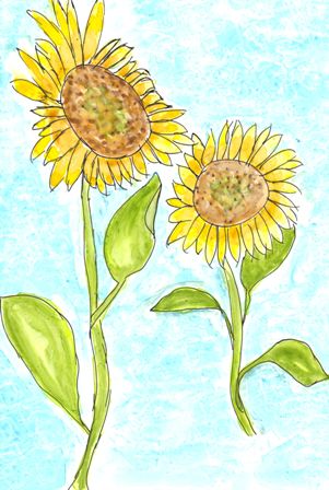
Yupo Sunflowers

My second Yupo experience. I drew the sunflowers with a rapidosketch fine point pen with permanent ink. The blue background is watercolor that I gently dabbed with a tissue for some texture before it was dry. The lighter version was done with Derwent Inktense Watercolor Pencils applied dry and gently blended with a wet brush. I thought it was too pale, so the darker version is where I added a layer of watercolor pigments. I was very careful with this layer as I wanted the lighter pencil pigments to show through.
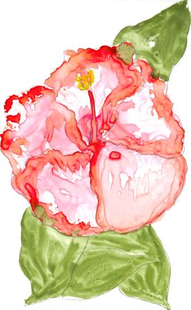
Hibiscus On Yupo
Well this was fun!! I've seen some watercolor work done on Yupo on the WetCanvas site and have been quite intrigued with it. It is not paper at all, but plastic with an extremely smooth surface. It IS sold as "suitable for all watercolor techniques." Since it is plastic, the paint and/or water does NOT penetrate it - it just kind of floats around until it dries. If you don't like something, you just wipe it off with a tissue - ha. Of course, if you want it to last, a fixative would have to be used on the finished work. I bought my Yupo from Dick Blick, but it is available from other suppliers as well. Because I have a tendency to be the controller, this was really a step out of my comfort zone as the watercolor is the controller and I became the controllee. Some Wetcanvas tips I remembered as I was going along with this are 1) Do NOT touch the area you will be painting. Skin oil puts a protective shield on the plastic and the paint will not adhere--you can see the white areas on this where my fingers touched the surface, but it was a happy goof because I rather liked the splotches! 2) Lay down the paint and move it around with a brush, or tilt the paper this way and that and let it run 3) To layer, make sure undercoat is completely dry, with a light touch apply the next layer. Once liquid is applied, the undercoat will become liquid again so much care needs to be taken. 4) If you totally goof, wipe it clean with wet tissue, Qtip or just dunk it in the sink and completely wash it off. 5) Do NOT use a blowdryer to dry it - Yupo can and will melt. A blowdryer on cool setting would probably not melt it, but it might make the paint run in places you don't want it. All in all, this was quite a liberating experience for me and I am eager to try this Yupo with some other mediums--wonder how permanent ink sketching would look - hmmmm.

Sunday, November 05, 2006


Morning Quiet Place

The November theme in Kate's alumni group is things we are thankful for. I have a chair in my living room where I read my bible and pray in the mornings. There are many objects in this painting that are symbolic for things I am thankful for in my life. I love America, I am so thankful I live in a country where I am free to own a bible and I am free to read it. I'm thankful that the word of God has been preserved for us and that the wisdom found in it pertain to all times, all generations and all situations. I'm thankful my husband shares my faith and respects my quiet place. I'm thankful I have raised my children and I no longer have to hurry through my morning quiet time. I'm thankful for electricity and while I love my oil lamp, I'm very thankful I don't have to rely upon it for light to read! I love the doily the lamp sits on and I am thankful for an aunt who taught me to crochet when I was 12 years old. One final note. . . the colors in this did not scan true, IRL the chair is a merlot color.

Saturday, October 28, 2006


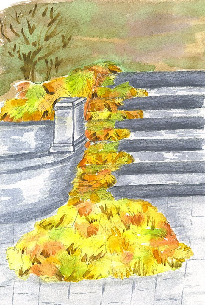
Leaves on Stairs.

Here's another Autumn scene. I think this may be my first work that included some architectural design. It was from a photo reference.

Thursday, October 19, 2006


Autumn Pond.

This was just another quick exercise in trying to get a looser style going. There was a really nice photo in our local paper this morning of a tree at the edge of a pond. There were ducks in the pond and more ducks flying in for a landing. OBVIOUSLY, I didn't paint from that photo - LOL!! However, it did give me an image in my head that I painted from. I guess this was simplification to the max. I'm just so happy to have some time to paint lately!!


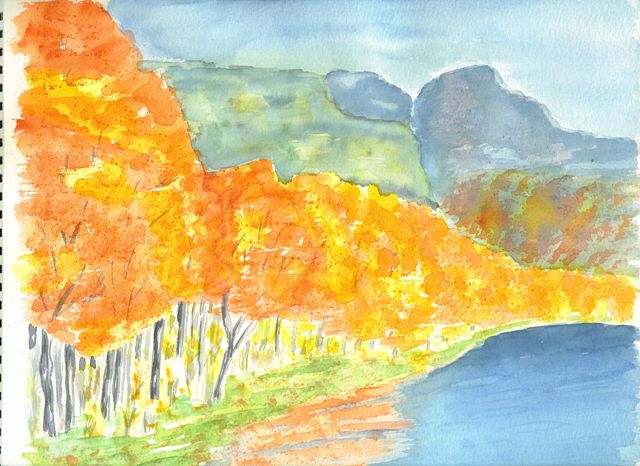
June Lake Aspens.

June Lake is on the eastern side of the California-Nevada Sierra Mountains. Along one side of the lake are aspens that have glorious color in the autumn. When my children were growing up, we went camping at June Lake every year and have many fond memories of our time there when we would fish and hike. One year as we were hiking, our Alaskan Malamute, Nikki, thought she could ford a rapidly moving stream. She was caught up and went down a very steep, boulder strewn waterfall! We all went tearing down the mountain after her (I don't know why we did this as there was no way any one of us could've gotten her out of that predicament). She got herself out with only one minor cut below her eye. She was very stiff and sore the next day, but handled it all rather well. We still think of that time and know it was nothing short of a miracle that she survived! Bears from nearby Yosemite would visit this campground frequently. One time we were sitting around our evening campfire and I actually smelled the bear that walked past our camp - a very musky odor! The next day we heard from fellow campers that this particular bear had sat near their tent and watched as their tethered dog barked at him. He must've known the dog couldn't charge and was quite arrogant about it. My memories are so vivid of this place and this painting does NOT do it justice. Maybe someday I'll be able to really capture the magnificence of it.

Wednesday, October 18, 2006

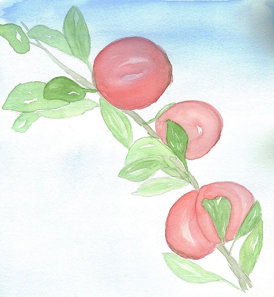
Red Apples. I wanted to do something really quick and also a bit loose -- I REALLY need practice with "loose!!" This was a good exercise and was fun to work on.
It is apple harvest season and my DH and I went to Tehachapi yesterday afternoon for a BBQ with some friends. I'd hoped to go early enough to buy some apples at one of the orchards, but time didn't allow. I guess that's why I had apples on my mind today and decided to paint this from a reference photo.

Thursday, October 12, 2006


Autumn Stream.

Well, here's another autumn landscape for this month's theme. I'm just not happy with this, but posted it anyway because it's good to see improvement later on - ha. I just really, really want to get to the point where my watercolors are more washy. Maybe it's a "control" issue and I want to control the paint instead of just letting it flow where it wants. I think the palette is okay and there are lights and darks, maybe there should be more of those though. Ugh! Reference photo is from Zion National Park and I left out the big Watchman Mountain in the background -- I like challenges, but that was a bit much.

Thursday, October 05, 2006


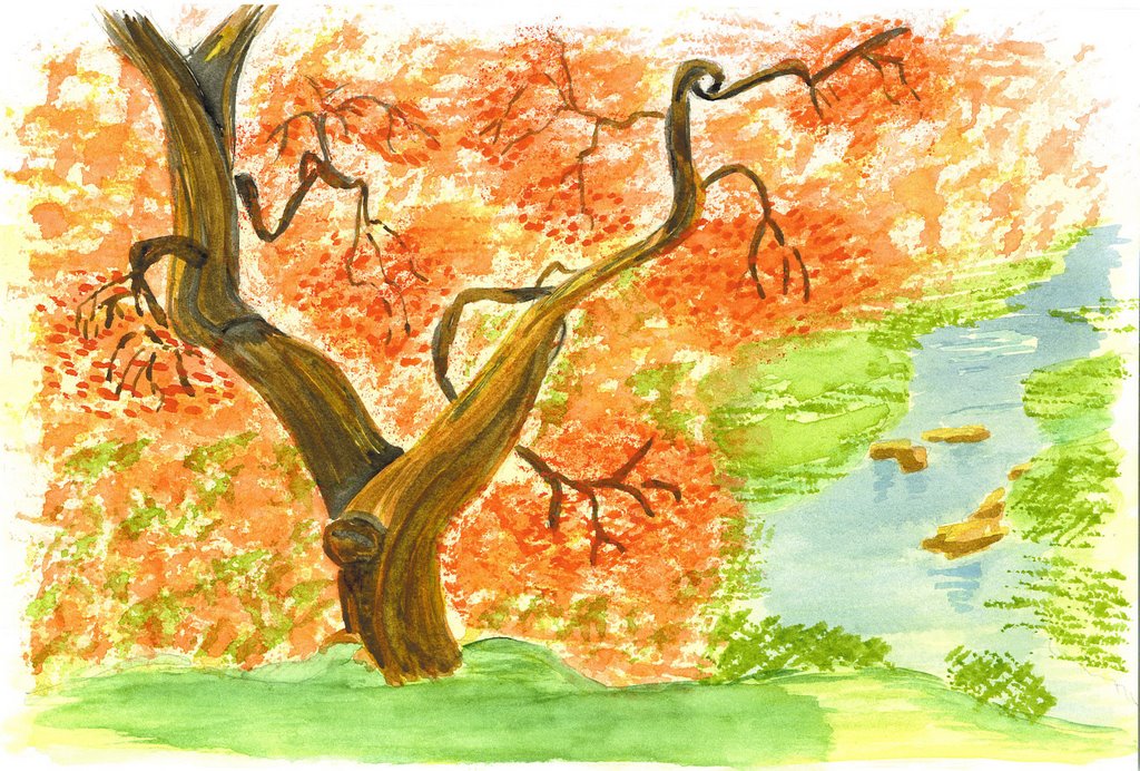
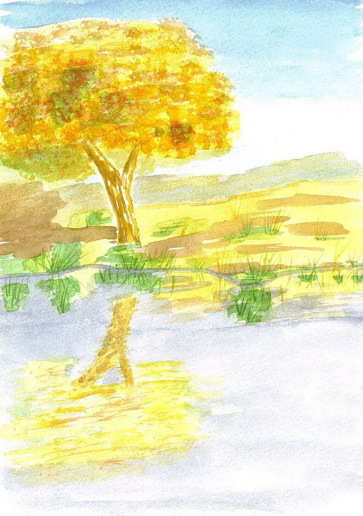
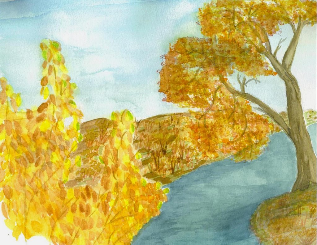
Autumn Tree.

Continuing with the autumn/harvest theme in Kate's Alumni group, I found the reference photo for this on Flickr. I'm especially happy with the little stream and how it really does appear to be fading away into the horizon. The pigments used on the tree trunk are darker than they appear on the scan - actually, the whole thing is darker than scanned! I enjoyed doing this little landscape and still want to do some more this month.

Sunday, October 01, 2006


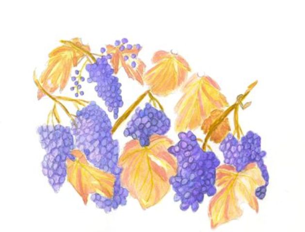
Cabernet Revised. I've added more leaves and grapes and also shaded the right side of the clusters to create the light source. It's still not what I had in my brain, but I think it's an improvement.

Now. . . back to my book studying to prepare to do a autumn landscape.

Saturday, September 30, 2006


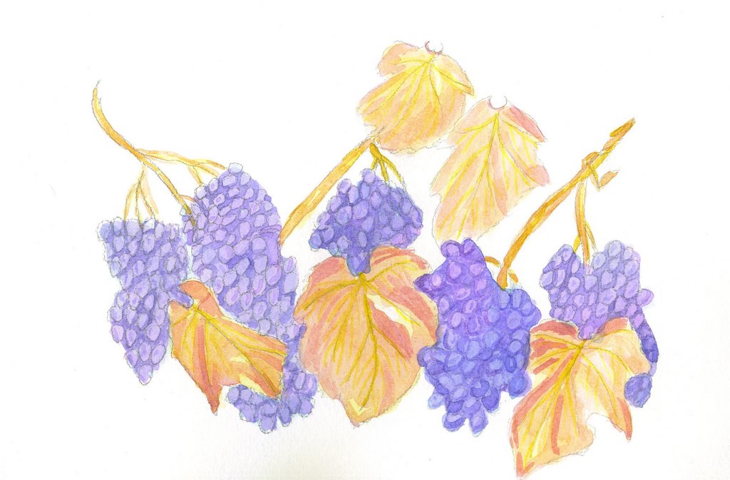
Second Cabernet. I struggled BIG TIME with these clusters. I like the leaves, but the grapes. . . especially the second cluster from the right - it's really wonka. I'm going through my art books for pointers on landscapes. I REALLY, REALLY want to do an autumn landscape for this month's theme.

Friday, September 29, 2006


Cabernet Harvest. The October theme for Kate's Alumni Group is Autumn/Harvest. I grew up in a small town in Northern California grape and wine country. A vivid memory I have is the harvest of the grapes in the fall. There was a winery near the elementary school I attended and I remember getting off the school bus and the pungent, sour aroma of the fermenting grapes permeating the cool, crisp fall air. All of us kids would wrinkle up our noses and say, yuck! Although I now live in Southern California, we have cool mornings in the fall and that special smell that comes with cooler weather always reminds me of the wineries of Northern California. This was done on Cotman paper, it is 7 x 9 and the paints are WN.

Tuesday, September 19, 2006

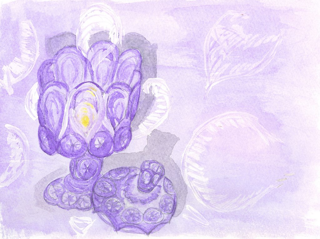
Amethyst Compote with Lid.

I've tried something rather unusual. . . I set this up with a candle in it and no direct lighting. I placed plain paper behind it to see the candlelight reflections and painted it pretty much "in the dark." Occasionally I turned on a light to see exactly where the brush was going. (I did have a small lamp on in the room, so I wasn't totally in the dark) I think it produced a rather interesting effect!

Thursday, September 14, 2006


Las Vegas basket. I helped my daughter and son-in-law move to Vegas and sketched and loosely painted this during a short break yesterday. As I looked around the living room at the boxes still unpacked. . . I spotted this basket and thought I'd do it to continue with the "container" theme. I bought a small half-pan field kit recently and this is the first time I'd used it--I'm very happy with it! It's the little WN with 12 half-pans. My son-in-law has taken a position as Pastoral Assistant at a new church in Vegas and my daughter will be the church secretary--what an exciting time for them!! The growth of that city is phenomenal; the potential for this church to grow beyond our expectations is tremendous!!
Thursday, September 07, 2006


Ugh! I think I've learned a lesson!! I couldn't get a good "sparkle" with this colored glass painting. I checked the pigments used and none of them were transparent--all were very opaque. I don't like this at all, but decided to post it anyway. I'm wondering, too, if maybe it would be better if I lift out some of the pigment. Hmmmm, think I'll try that!!

Tuesday, September 05, 2006


End of Season. This is painted from a photo taken by Joe Philipson. Lin Frye, from Cathy Johnson's alumni student site, pointed out that it was appropriate for Labor Day. How correct she is! The empty beach really does portray the end of the summer season. This was fun and quick (30 min)! It is on Canson and pigments used were Cerulean Blue, Prussian Blue, Van Dyke Brown, Cad Yellow Pale, and Palette Greens.
Monday, September 04, 2006


Blue Banana Bowl. I'm not sure of the manufacturer, either an L E Smith or a L G Wright in the Moon and Stars Pattern. Oh, I don't like working with BLUE! IRL, this bowl is more turquoise. I used Cerulean Blue and UM Blue -- couldn't quite get the right coloring. I was working under artificial light and while painting the bowl, the sun starting coming in through a nearby window. Wow! what a reflection starting happening. I didn't want to lose that moment, so quickly masked some shooting stars into the shadow area. This is done on the Bristol paper and is a combination of some wet-in-wet and some dry brush.
Saturday, September 02, 2006


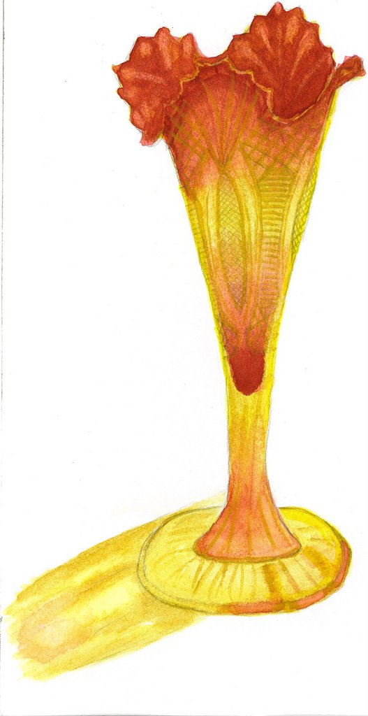
L E Smith Amberina Vase in the Heritage Pattern. The September theme for the online watercolor painting group is "containers." This is my first work for the month. A couple of years ago, I decided to redo all my family room decor and I went NUTS buying L. E. Smith and L. G. Wright pressed glass items on ebay! I absolutely love my traditional family room with vintage and art deco accessories. While they will certainly be a challenge to paint, I'm planning on doing quite a few for our container theme. I used the Strathmore Bristol paper and did dry brush technique. The pigments used were a glaze of Yellow Ochre with Alizarin Crimson and Cad Yellow Pale overlays. I opted not to paint a background. This is my first painting of "glassware," and I did find it challenging. I have a long way to go regarding capturing facets of light and will be doing some research to try to learn how to capture those.